JOHN DEERE: RUNNING THE FARM FROM A PHONE
Bringing John Deere's whole app portfolio—account, equipment, operations, financial—to where farmers actually work: a phone in a gloved hand, in the field, with the signal dropping.
01 · The Problem
A farmer runs their business from the cab, not a desk. But John Deere's software grew up on the desktop—so the moment a customer reached for their phone in a field, they hit five or six separate apps (equipment, operations, parts, financial, dealer support), each built by a different team, each with its own login and its own idea of navigation.
Manageable at an office desk. Miserable standing in a field with gloves on and one bar of signal. The phone wasn't the web product shrunk down—it was the surface where the seams hurt most, and where fixing them mattered most, because the field is where the work actually happens.
02 · Why This Was Hard
This wasn't one app's redesign. It was a mobile system that had to land across an organization—and survive the field:
- 40+ product teams on independent backlogs, across iOS, Android, and in-cab displays
- 6 brands with distinct identities that still had to feel like one Deere in your hand
- The field itself: gloves, glare, dust, and a signal that quits the moment you leave the yard
- 500K+ users across 12 languages, from highly technical operators to customers without reliable email
- Account sensitivity: equipment, financial, and operational data sat behind these flows—the bar for trust on a personal device was high
A design imposed top-down would have been ignored. The system had to be good enough that 40+ teams chose it.
03 · One Account, Every App
The fix was the connective tissue every app shares—sign-in, account, organization, profile, and navigation—designed once and adopted across the portfolio. On mobile that's not a nicety; it's the difference between working and not:
- One account, carried everywhere: sign in once and the same identity, organization, and profile surface in every app—so you're not logging into five apps in a dead zone.
- One way to navigate: consistent tabs, section hierarchy, and back-behavior, so a pattern learned in one app transfers to the next when you don't have time and no signal to relearn it.
- One front door: a portfolio hub to find and move between the apps that fit your operation.
- Onboarding that earns the data: progressive account and license setup—the mobile face of the adoption work that lifted authenticated active users.
04 · Designed for the Field
Every decision started from the customer's hands and their context—a moving cab, direct sun, gloves, and connectivity that quits the moment they leave the yard. The craft was making enterprise software survive that.
Built for gloved hands
Oversized targets and one-handed reach. Nobody pulls off a work glove to tap a minimum-size button—so nothing critical lived at minimum size.
Legible in direct sun
High-contrast type and state colors that hold up through glare on a dusty screen, not just in a design tool on a bright monitor.
Offline-tolerant by default
Account, equipment, and key data cached; actions queue and reconcile when signal returns. The field has dead zones—the app couldn't.
One sign-in, no re-login
Authenticate once and the identity carries across every app, so a low-signal field never locks a customer out of the next tool they need.
Localized at a glance
The same patterns had to read correctly across 12 languages—for operators working in English, Spanish, or German—without breaking the layout.
The license and account work specifically—mapping every state (active, expired, transferred, dealer-managed) for the device in a customer's pocket—was the part they actually felt. The completion and support-ticket gains live in the Forced Adoption story; this page's contribution was making them hold up in a cab, in the sun, offline.
05 · Consistency at Scale
None of this holds without a system the teams can build from. I helped establish the enterprise design system in Figma — spanning 6 brands and 40+ teams — and shipped the account and navigation patterns as dev-ready components: tokens, prop specs, full state coverage. The result was consistency that didn't depend on willpower.
06 · What It Proves
The hard part of enterprise mobile isn't any single screen—it's making a portfolio built by many teams feel like one product, on the device where customers actually work, in the conditions they actually work in.
Start from the customer's hands and their field, design the shared layer once, and give 40+ teams a reason to adopt it. The screens change app to app; the experience of being one customer of one company, out where the work happens, doesn't.
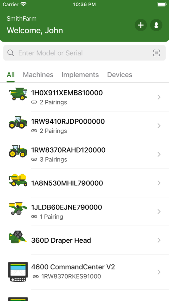
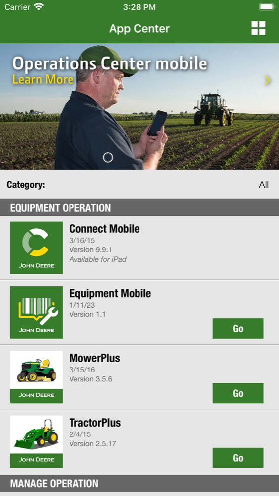
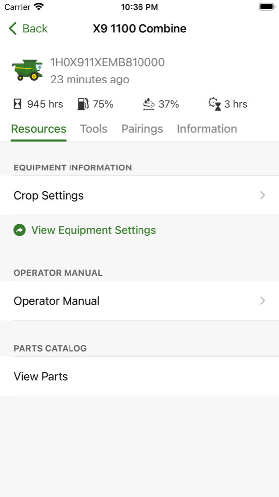
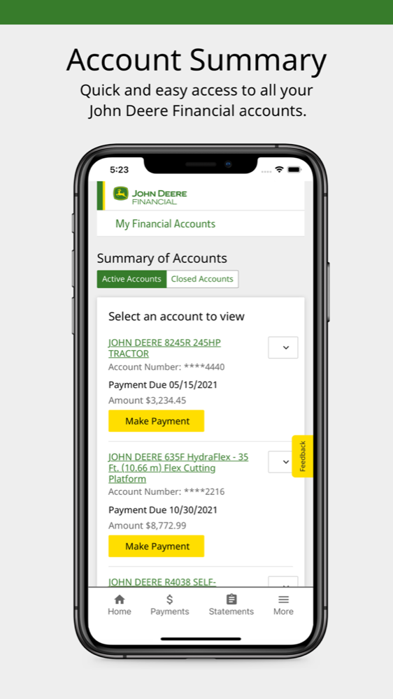
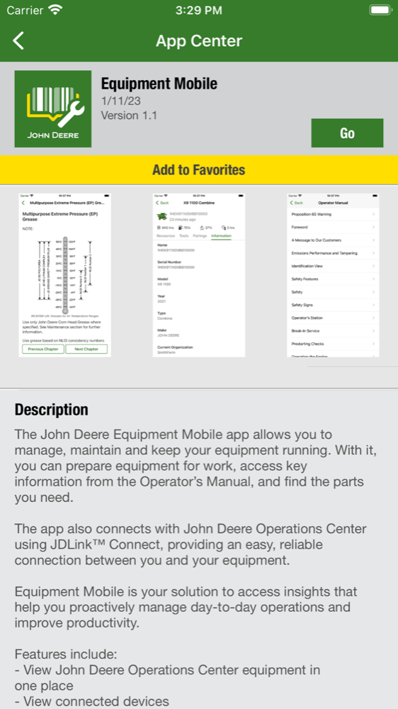
Gallery
LET'S TALK
Working on something like this — or hiring for it?