
HOW I WORK
The approach underneath the case studies, how I think, the teams where I thrive, and the raw artifacts where the decisions actually got made.
The work underneath this: connected-equipment software at John Deere, freight visibility at FourKites, in-flight systems at Gogo, and my own hardware company. Different industries, one repeated problem: a system that works on paper and gets routed around in practice.
How I Think
The design problems that stall a big company are usually not design problems. They're trust, incentive and alignment problems, and they all land in the same place: the moment a busy person decides whether to use what you built or route around it. What follows is how I find that moment and build through it.
The examples come from four employers, so briefly: John Deere builds agricultural and construction machinery; FourKites tracks freight in real time for the shippers and carriers moving it; Maven Wave placed Agile and UX teams inside large enterprises; Thios is my own company, selling open-source modular hardware plans direct.
1. Understand the system before touching pixels.
Every hard enterprise problem is a systems problem wearing a UI costume. Before I draw a screen I map the states, transitions and edge cases the interface has to survive, because a flow that only handles the happy path is a prototype, not a product. At Deere the "licensing screen" turned out to be one machine that could sit in several consent conditions at once. That screen decides what a customer can switch on, which is how Deere sells its connected services, so getting it wrong is expensive. Nothing got simple until the system underneath did.
In practice → Deere: the licensing matrix, mapped before any screen
2. Find where complexity actually lives.
Complexity is rarely where the ticket says it is. Before proposing anything I find where it actually concentrates. Usually one rule, one incentive or one moment of mistrust is carrying most of the weight, while the visible symptoms scatter across a dozen screens. Naming that knot precisely is the diagnosis. Get it wrong and every screen you touch afterward is a guess.
In practice → FourKites: the fix was driver incentives, not the app
3. Simplify rules before simplifying interfaces.
Once I know where the complexity lives, I fix the rules before the interface: collapse overlapping states into a single sequence, cut how many things can be true at once, and delete rules instead of adding UI to explain them. The screen inherits whatever clarity, or mess, the rules underneath it carry. A clean UI on a tangled rule set is a promise the product can't keep.
In practice → Deere: collapsing the matrix into one sequence
4. Prototype with engineering early.
Design handed over a wall arrives late and wrong. I prototype in code and sit with engineers while constraints are still cheap to change. Feasibility is a design input. It is not a veto that turns up at the end. Half of good enterprise design is knowing what the system can actually do, and the fastest way to know is to build a little of it yourself.
In practice → Thios: prototyping the whole system in code, solo
5. Design for adoption, not approval.
A design that wins the review and loses the user is a failure with good optics. Sign-off is a checkpoint; adoption is the goal. I design for the moment a busy person decides whether to route around the thing I built, and I'd rather ship something that survives that decision than something that photographs well in a deck.
One job underneath all five: make hard systems trustworthy enough that people actually use them. The rest is just knowing, on a given problem, which of these to reach for first.
Working With Me
A résumé tells you what I've done. This is the shorter, more honest version of what I'm actually like to build with.
What I Like Building
I like problems that look impossible on a whiteboard: a state space that explodes, a workflow nobody can hold in their head, a platform that grew twelve different ways and now has to feel like one. I'm happiest on the operational tools real people depend on to do real work. The control tower where a dispatcher watches every shipment in motion and stakes a big call on what it says. The flow half a million equipment operators have to trust. The design system that keeps six surfaces telling the same story. One genuinely hard thing made usable beats ten easy things made pretty. And I build all the way down now: I spec the screen, then prototype it in code until it actually works.
Teams Where I Thrive
I do my best work close to the problem and close to the people solving it. Small, senior teams where I can talk to an engineer without booking a meeting. Rooms where ambiguity is expected and "I don't know yet, let me build a version" is a normal answer. I want real ownership of one hard surface over a sliver of ten. I value direct, honest feedback over politeness, and I'll give it back the same way. And I'm allergic to process theater: status rituals that produce decks instead of decisions. Give me a clear problem, real users, and people who'd rather ship and learn than argue in the abstract, and I'll go a long way.
Why Enterprise
Consumer design mostly fights for attention. Enterprise design fights for clarity, and I find that far more interesting. The problems are genuinely hard: overlapping states, competing incentives, decades of legacy, and users who will route around anything that wastes their time. Nobody's there for the delight; they're there to get a job done, and when you make that job noticeably easier, you can feel it. The stakes are real, too: the dashboard someone bets a contract on, the flow that gates a multi-billion-dollar business. I like that the work matters to someone's actual day, and that "is it usable" isn't a nice-to-have. It's the whole game.
AI, How It Changed My Workflow
AI collapsed the distance between knowing what to build and building it. I've always been able to spec a system; now I can prototype it in code, wire up the data, and put a working version in front of people in the time it used to take to make a clickable mockup. That changes what design even is for me: I can test a hard interaction against reality instead of arguing about it in Figma. It's how I built and shipped Thios's six surfaces solo, and it's part of my daily workflow now. I don't think it replaces judgment. It just means one person's judgment can reach a lot further than it used to.
Process
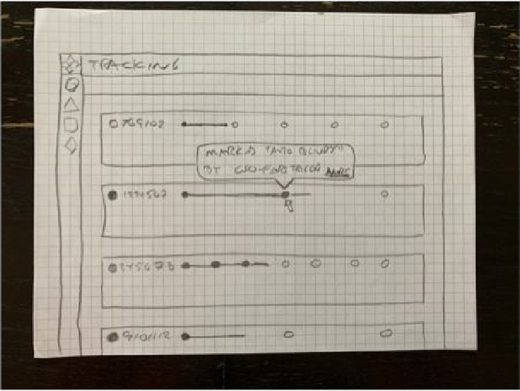
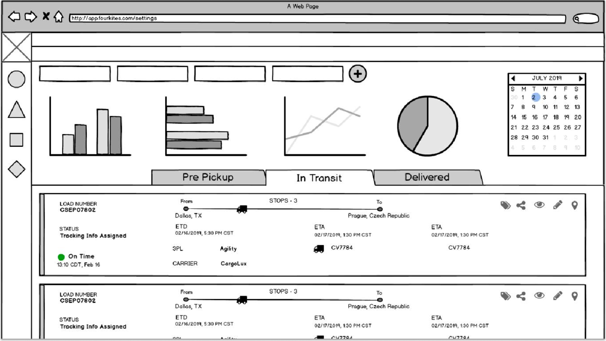
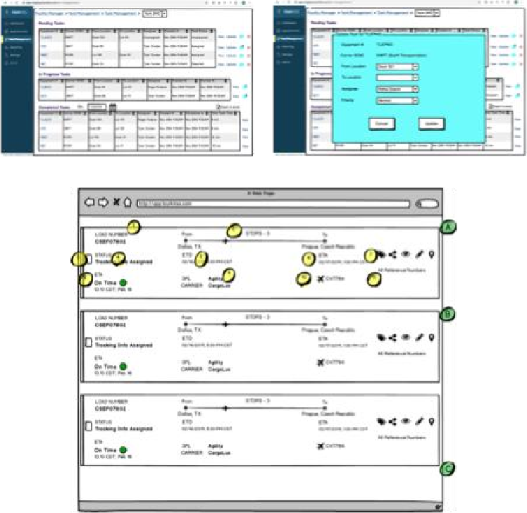
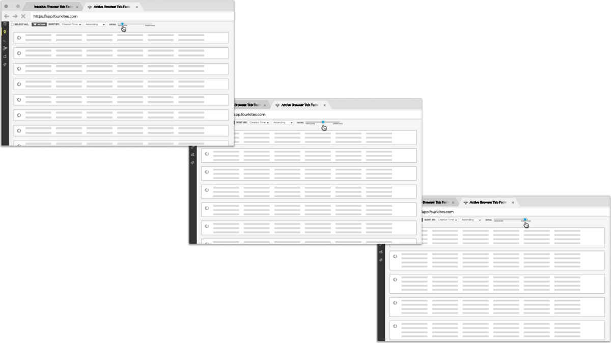
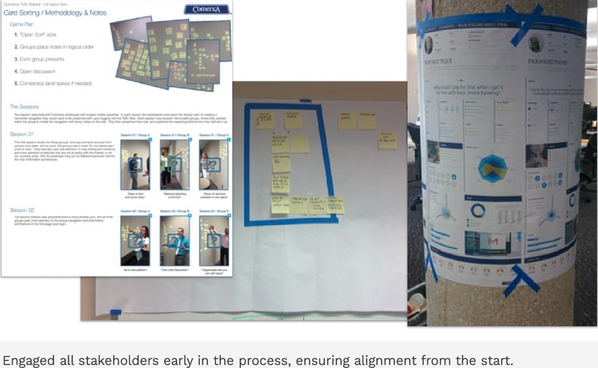
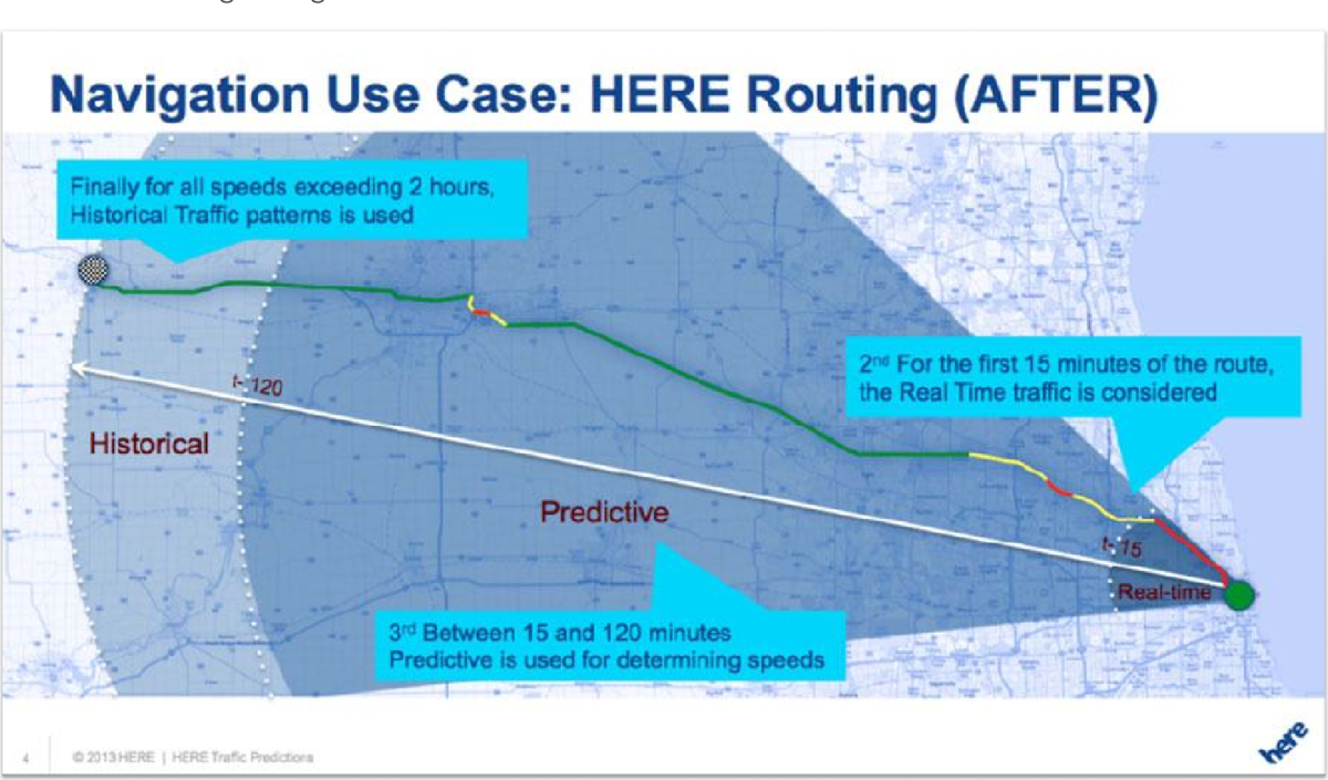
Portfolios show the polished result. This shows the work before it was presentable: pencil on graph paper, rough wireframes, card sorts where people group the content into their own categories, decision logic scrawled until it made sense. Trust the thinking over the mockup. Visible thinking is harder to fake than a finished screen.
// SKETCHES
// WIREFRAMES & EXPLORATION
// RESEARCH & INFORMATION ARCHITECTURE
// SYSTEMS & DECISION LOGIC
None of this was meant to be seen. That's exactly why it's worth showing.
LET'S TALK
Interested in discussing enterprise design challenges or exploring opportunities?