The messy middle — the sketches, wireframes, and card sorts where the decisions actually got made.
Portfolios show the polished result. This page shows the work before it was presentable: pencil on graph paper, low-fi wireframes, card sorts, decision-logic scrawled until it made sense. I'd rather you trust the thinking than the mockup — visible thinking is harder to fake than a finished screen.
// SKETCHES
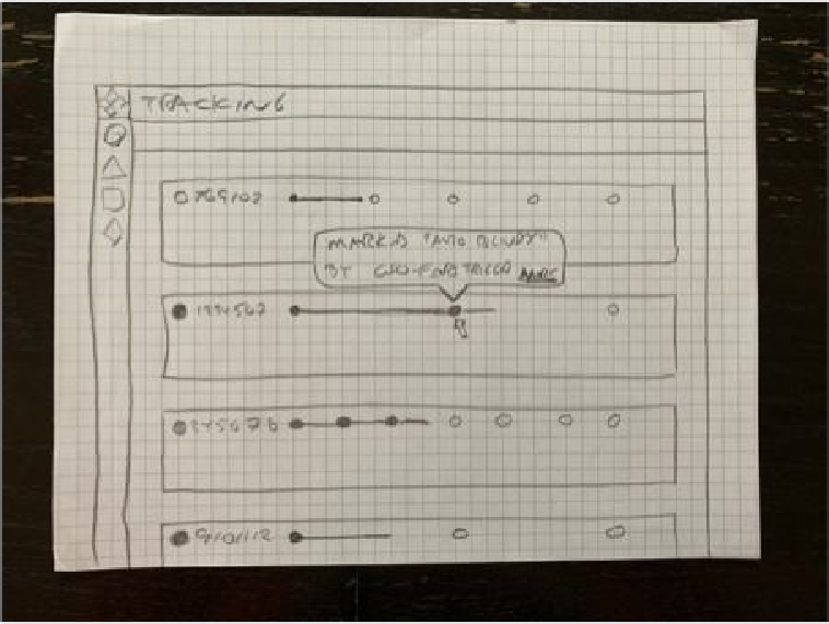
Different modes, different steps. Working out how one tracking row shows a journey when each transit mode — ocean, truck, rail — has a different number of stops. The timeline had to flex to whatever a shipment actually needed, not assume a fixed set of steps.
// WIREFRAMES & EXPLORATION
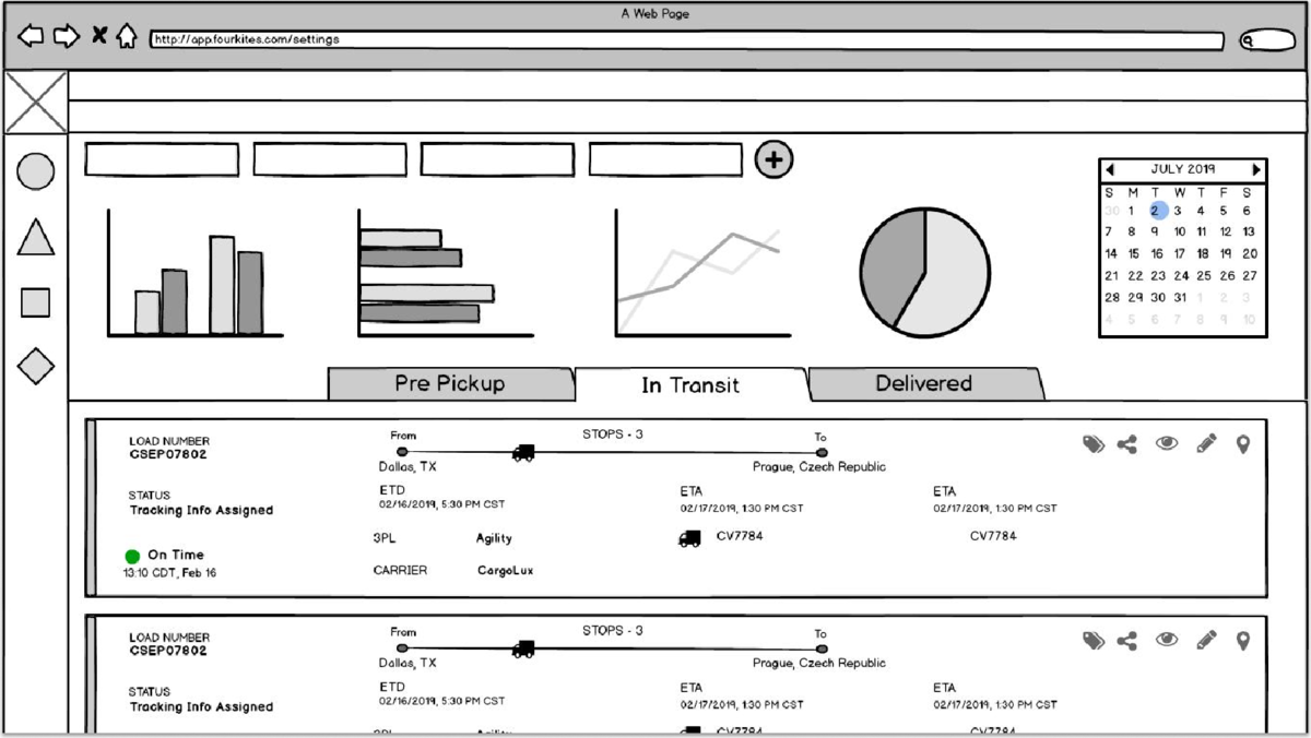
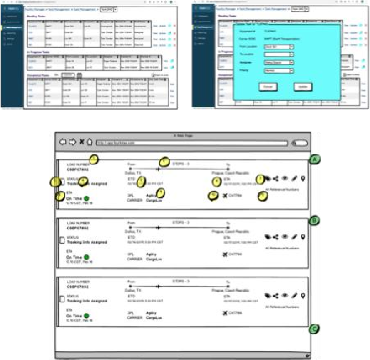
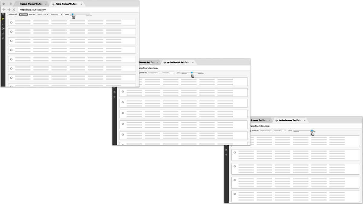
Low-fi first. Arranging the information — loads, stops, ETAs, status — before committing a single pixel of visual design.Then argue with it. The callouts are the case for why each element earns its place — and where the edge cases live.How dense is too dense? Three passes at the same list, each packing more data into every row. Enterprise operators want density — the exploration is finding the point where a scannable table turns into a wall.
// RESEARCH & INFORMATION ARCHITECTURE
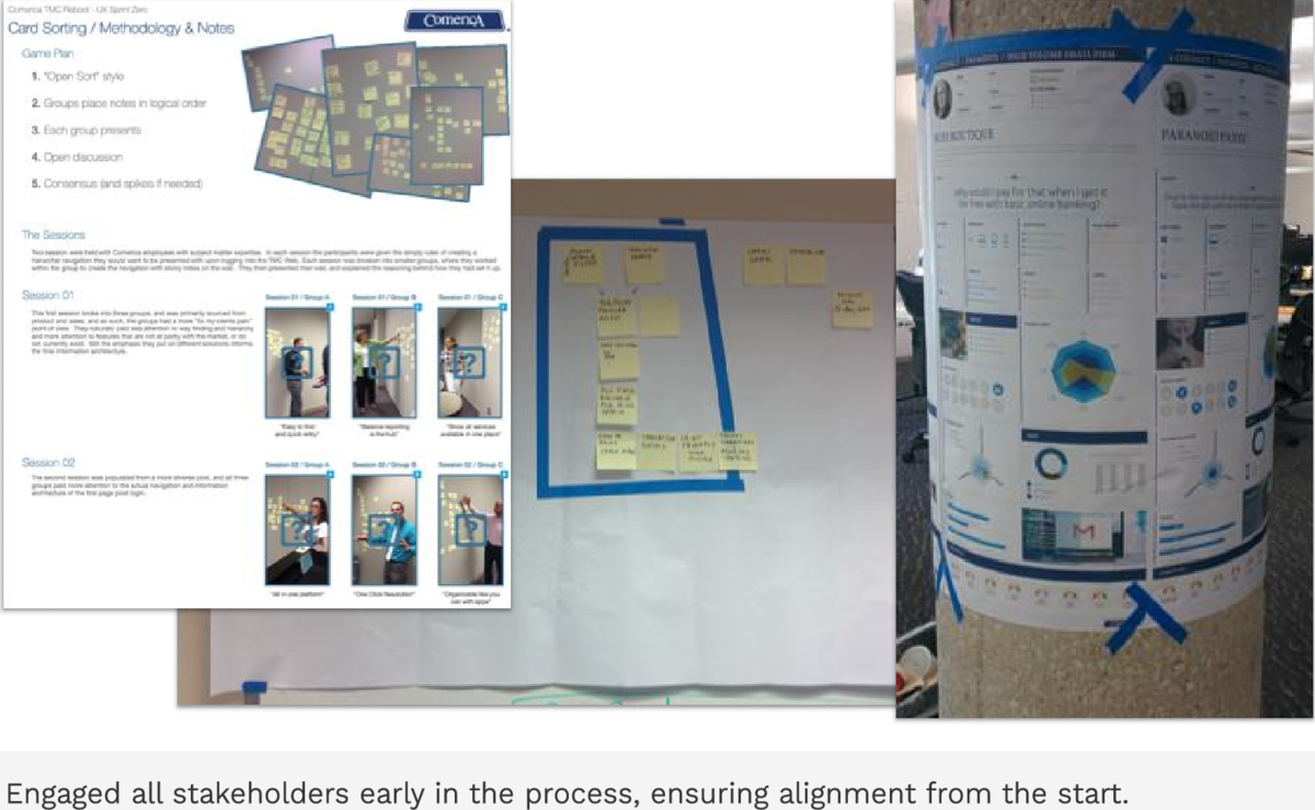
Alignment happens in the room, not the deck. Open card sorts with the actual employees, then the resulting IA taped to a column everyone had to walk past. Stakeholders who build the structure themselves defend it later.
// SYSTEMS & DECISION LOGIC
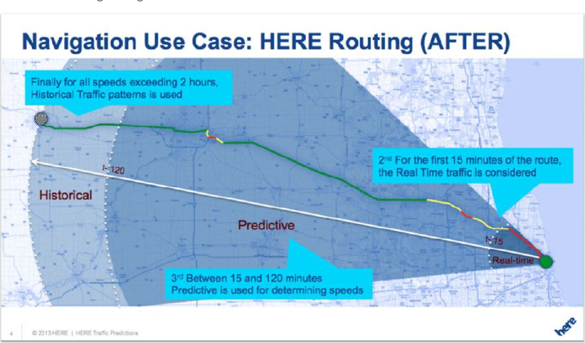
Draw the decision, then design it. How HERE's routing engine chooses which data to trust — real-time for the first 15 minutes, predictive out to two hours, historical beyond. Legible logic is what made the product explainable to customers.
None of this was meant to be seen. That's the point — it's easier to trust the thinking than the screenshot.
LET'S TALK
Interested in discussing enterprise design challenges or exploring opportunities?